Watercolor tattoos fade faster than any other style — that fact is in nearly every guide written about them. What guides usually skip: by how much, by when, and what you can do about it before you book.
TL;DR: Watercolor tattoos do fade — pastels and yellows visibly in 5–7 years; 10+ years with daily SPF and an artist who underpaints a faint black skeleton anchoring the color washes.
What watercolor actually is — and what it isn't
Watercolor as a tattoo style is defined by what it doesn't have: no bold black outline holding the design's shape, no flat color blocks separated by hard borders. The aesthetic borrows from watercolor painting on paper — soft transitions between hues, color "bleeds" at the edges, splatter effects that look spontaneous on skin.
A few things the style is regularly misrepresented as:
- The "watercolor ink" myth. There's no special pigment sold as "watercolor tattoo ink" — the same colored inks used in any color tattoo produce the watercolor look; the difference is how the artist applies them.
- The "watered down" myth. The wet, diluted appearance comes from layering thin saturation passes and using whip-shading to feather edges, not from actual ink dilution.
- The "no outline ever" myth. Some watercolor artists work fully outline-free; many use a deliberate light skeleton (covered in the hybrid section below) intended to hold color in place over years.
What it is, technically: layered color washes built up in translucent passes, edges feathered rather than defined, and composition that prioritizes mood and atmosphere over readability at distance. The style maps well to floral subjects, abstract splashes, fluid animals (fish, jellyfish, butterflies), and impressionistic memorial pieces. It maps poorly to anything that needs to read sharp at year five — portraits, text, intricate symbolism.
Yes, watercolor fades. Here's the honest timeline.
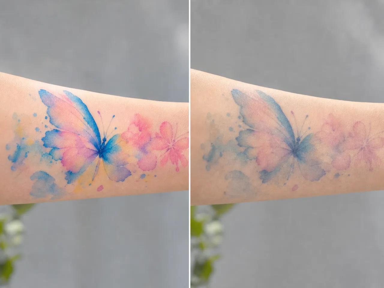
Watercolor fading isn't a defect of the style — it's a consequence of the absence of mechanical anchoring. In a traditional or fine-line tattoo, the black outline acts as a structural cage that holds color in place even as skin and ink slowly migrate over decades. Without that cage, watercolor pigments drift and lighten faster than equivalent color work in any other style.
Honest fade timeline by color group:
- Lightest pastels (sky blue, pale pink, light yellow): visible softening at year two, noticeable fading at year four, blurry by year six. These are the colors that go first.
- Yellows and oranges: the most vulnerable category overall. UV breaks down these pigments faster than other colors, and they have less density to begin with. Expect visible degradation by year three or four.
- Saturated mid-tones (rich blue, deep red, forest green): cleaner aging. Visible softening at year five or six, still recognizable at year ten.
- Black (if hybrid skeleton present): holds essentially indefinitely. A faint black underpainting still reads as definition fifteen-plus years later.
These ranges assume average care: occasional sun exposure, no daily sunscreen specifically on the tattoo, normal aging. With strict daily SPF 50+ on the tattoo whenever sun-exposed, you can typically push each range out three to five years. With zero SPF and frequent beach time, cut everything in half.
Touch-up rhythm matters. Watercolor tattoos that get a refresh pass every three to five years can look essentially fresh at decade fifteen. Watercolor tattoos that never get touched up tend to look identifiable but degraded by year eight.
Honest caveat: these aren't from a controlled study. They're patterns reported across tattoo studios that work in watercolor regularly. The actual range your tattoo sits in depends on your skin type, sun habits, placement, and the artist's pigment choices — variables no general guide can pin down.
UV is the dominant accelerator across every color. Friction zones (inner wrist, fingers, top of foot) compound the problem; place watercolor on those zones and the timelines above contract by another year or two. The placement guide goes deeper on body zone aging; the short version for watercolor is: outer forearm, outer thigh, calf, or upper back — kept covered or sunscreened.
The hybrid that solves most of the problem
Most watercolor guides leave readers thinking the trade-off is binary: get the soft, painterly look and accept the fade, or get traditional bold-outline work and miss the aesthetic. There's a third option that the guides rarely cover but most experienced watercolor artists already use.
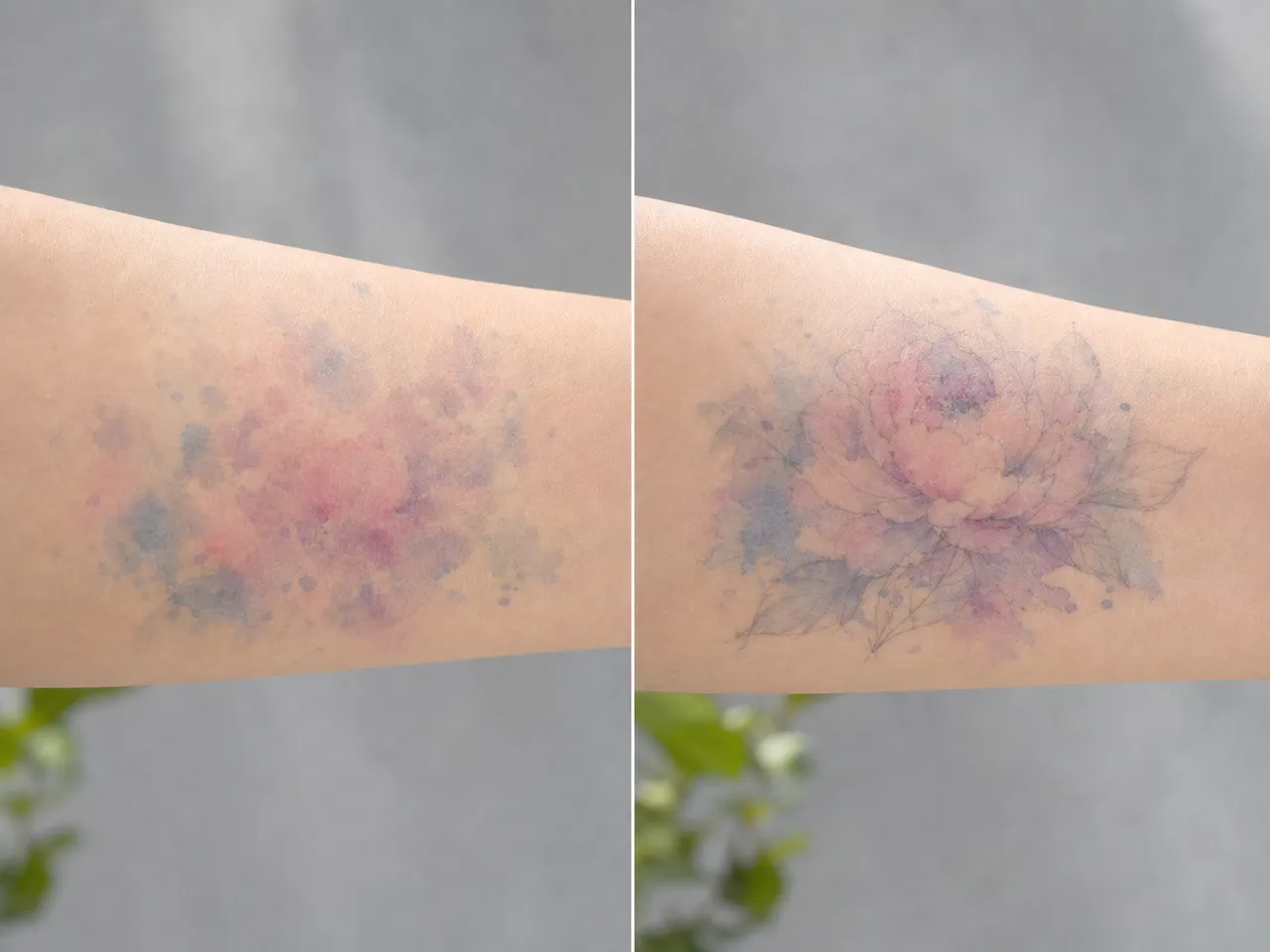
The technique is a faint black skeleton — thin, sparse linework laid down under the color washes — that holds the design's structural integrity while the color does the painterly work above it.
How it differs from a traditional outline:
- The lines are deliberately thin and incomplete. Not closed contours wrapped around every shape, but suggestive marks that anchor key edges (the spine of a feather, the eye of a fish, the central stem of a botanical).
- The black sits under the color rather than around it. Where color washes pass over the skeleton, the line is visible as a faint deeper tone, not a sharp border.
- It's still recognizably watercolor at five paces. From a step or two away, the design reads as a soft painterly piece. Close inspection reveals the linework holding it together.
This approach coexists with purist watercolor — many purists prefer no skeleton at all, and there's an aesthetic case for letting the work age into something blurrier and more atmospheric. But if you want the look without the worst-case fade, ask your artist specifically whether they incorporate a black or dark-grey underpainting. Many will say yes by default. Some won't, in which case you have a real artistic decision to weigh.
A practical question to ask at consult: "how does this design hold up at year eight if I don't get touch-ups?" The artist's answer reveals whether they've thought about durability and whether they use the hybrid approach.
When watercolor is the right pick anyway
Knowing watercolor fades faster than other styles doesn't mean skipping the style. The fact is information for deciding whether the trade-off matches your situation. Watercolor is the right pick when:
- Subject is abstract or impressionistic, not realistic. Watercolor's strength is mood and atmosphere; it underperforms when asked to render specific detail. Florals, jellyfish, splashes, paint drips, fluid animals translate beautifully. Realistic faces, intricate scenes, text — these styles need bolder line work to hold up.
- You're prepared for the touch-up rhythm. If you're willing to revisit every three to five years for a refresh pass, watercolor's "fade and refresh" cycle works fine. If you want a one-and-done tattoo that looks identical in fifteen years, watercolor isn't the style.
- The piece sits in a low-friction, low-sun zone. Upper outer arm, upper back, ribs (if you can stay diligent with SPF), outer thigh, calf. Avoid inner wrist, fingers, top of foot, sides of palms — even the hybrid skeleton can't fully protect placements with high mechanical abrasion.
- You have access to an experienced watercolor artist. The style is technically harder than traditional or fine line — pigment saturation, layering rhythm, edge feathering all require specific skill. A generalist tattoo artist's first watercolor commission rarely looks as good or holds up as long as a watercolor specialist's work.
When watercolor is the wrong pick:
- Memorial pieces you want to last permanently without refresh
- Designs with critical fine text or detail
- Body zones with high sun or friction exposure and no plan for SPF
- Budget that doesn't accommodate touch-up rhythm — the touch-ups are part of the total cost
Using AI to test the look before committing
Watercolor is a style where the visual feels right or doesn't — there's no analytical framework for "is this design good in watercolor." Either the soft transitions land for you or they don't. AI preview is unusually useful for watercolor specifically because the bottleneck is taste, not specification.
What works:
- Testing palette directions — running the same subject prompt with "pastel watercolor," "saturated jewel-tone watercolor," "cool blue watercolor," "autumn warm watercolor." Seeing which palette resonates before paying an artist to render it.
- Testing subject + style fit — does your specific concept (a fox, a peony, a memorial silhouette) translate well in watercolor? AI shows you the answer in 30 seconds.
- Testing complexity — running "minimal watercolor splash" vs "complex watercolor scene" to see whether you want restrained or maximal.
What AI can't do: design the black skeleton underpainting (that's an artist's call) or judge how your watercolor design will look in five years (no model has long-term fade modeling).
InkedByAI's generator covers watercolor as one of its 22 style presets. Free tier gives six credits — enough to test four or five palette directions on the same subject. The AI tattoo design walkthrough goes deeper on prompt approach for color-heavy styles specifically. For a contrast point on the opposite end of the spectrum, the fine line guide covers a style where the outline IS the whole identity — useful frame for understanding why watercolor's outline-less aesthetic asks for the trade-offs it does.
Watercolor rewards the people who book it knowing what they're trading. It will fade faster than other styles. The fade can be slowed but not stopped. The aesthetic is genuinely different from anything else a tattoo artist can produce — soft, atmospheric, painterly — which is precisely why people pick it. If that trade reads as worth it, watercolor is the style. If it doesn't, pick something with bolder structure and revisit the watercolor option for a future piece.
