Fine line is the style first-timers ask AI generators for most. It's also the style AI gets wrong most often — and the style that ages worst on skin. None of those facts are coincidences.
TL;DR: AI fine line output reads as "delicate sketch" because models render lines too thin for skin to actually hold. Get usable output by specifying single-needle linework + flash sheet aesthetic, then expect your artist to scale line weight up 30–50% in translation. Pick low-friction placement to slow the inevitable fade.
What "Fine Line" Actually Means (and Why AI Gets It Wrong the Most)
Fine line as a tattoo style has a narrow technical definition: single-needle (or 3RL at most), hairline ink weight, minimal-to-no shading, almost always monochrome black or grey. Subjects skew minimalist — single botanical stems, geometric primitives, small animal silhouettes, single-continuous-line portraits.
AI generators struggle with this style more than any other for one reason: their training data is mostly illustration, not tattooing. In illustration, thin lines are normal. On skin, thin lines are physics-bound — ink spreads, skin pulls, and any line below about 0.5mm becomes unreadable within a few years. The model doesn't know that. It renders what looks beautiful at screen-pixel density, which is finer than skin can durably hold.
The output reads as "delicate sketch," which is exactly what people want until they realize their tattoo artist is going to substantially redraw it before any needle touches skin.
The Line Weight Problem: Why AI Output Reads "Sketch" Instead of "Tattoo"
This is the single biggest gap between AI output and tattoo reality.
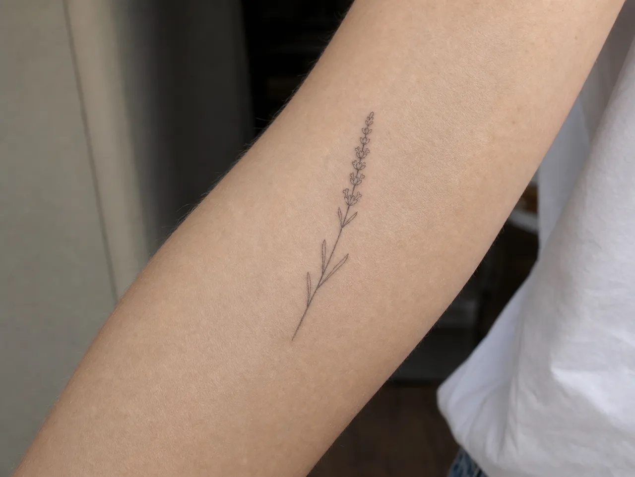
When a model renders a fine line design, the lines it produces look gorgeous on screen — clean, precise, hairline-thin. The problem is that hairline-thin doesn't survive on skin. Ink spreads outward from the needle's entry point over the first few months. A line rendered at 0.3mm thickness on screen translates to about 0.5–0.6mm on skin at month one, and drifts toward 0.7–0.8mm by year three as ink continues to settle.
The minimum line weight that stays cleanly readable for a decade is somewhere around 0.5mm at the time of tattooing. AI doesn't know to add that margin, so the artist does. Expect your final tattoo to have lines about 30–50% thicker than what the AI rendered. That's not a quality compromise — it's how the design actually has to look to age well.
The prompt-side fix is to use language that biases the model toward sturdier line work: "single-needle linework," "tattoo-ready linework," "visible line weight," "flash sheet aesthetic." Avoid "delicate," "ethereal," "wispy," "barely there" — they push the model toward the unviable thin end.
Subject Matter That Actually Translates to Fine Line
Fine line is a subtractive style. The fewer elements, the better the result both in AI output and on skin. Subjects that consistently translate:
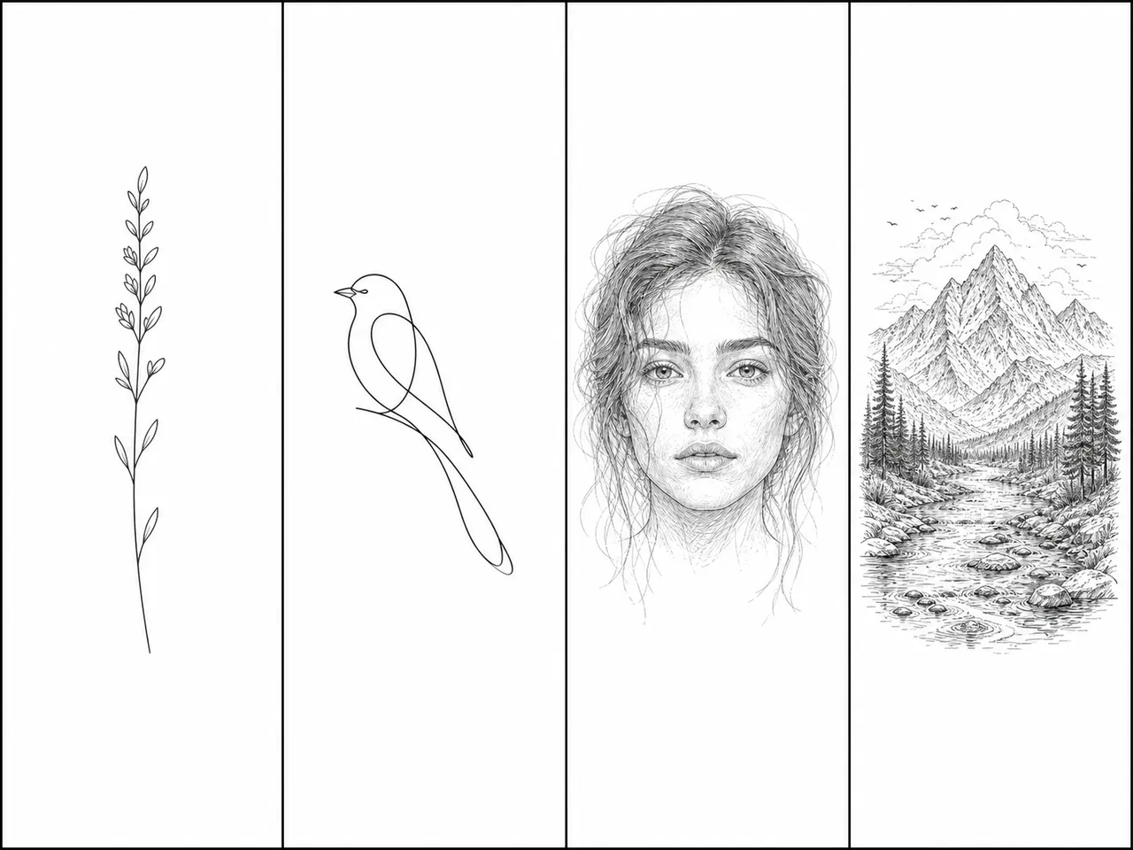
- Single botanicals — one stem with sparse leaves, one flower with minimal petals. Lavender, fern, wildflowers, eucalyptus.
- Geometric primitives — circles, triangles, simple mandalas with airy spacing. Sacred-geometry-lite, not maximal pattern fills.
- Small animal silhouettes — birds, snakes, foxes rendered in single continuous line. Not realistic animal portraits.
- Continuous-line portraits — abstract faces using one unbroken stroke. Works in fine line; fails as soon as you ask for "realistic."
- Short text — single words or initials. Anything more than 4–5 words at fine line weight will blur into illegibility within 2 years.
Subjects that AI renders beautifully but don't work as actual fine line tattoos:
- Realistic human or animal faces (need shading depth that fine line can't deliver)
- Complex landscapes or scenes (too many fine elements in one design = visual mush in year two)
- Anything with built-in cross-hatching, stippling, or shaded depth — those techniques need thicker line weight to read
If the AI output you love has any of the second group, treat it as inspiration for a different style (single-needle blackwork, micro-realism), not as a fine line piece.
Prompt Patterns That Get Usable Fine Line Output
After running enough fine line prompts through different generators, a few patterns hold up better than others.
The reliable template:
[subject], single-needle fine line tattoo design, monochrome black ink, centered composition, no shading, no background, flash sheet aesthetic, photographed on pale skin
The pieces that matter:
- "single-needle" — biases the model toward thinner-but-not-thinnest line weight (AI defaults still skew too thin, but this anchors the technique)
- "flash sheet aesthetic" — pulls the model toward tattoo-conventions (centered, isolated subject, no decorative framing) instead of illustration conventions
- "no shading" — fine line is defined by absence; explicitly forbidding shading prevents the model from filling space
- "no background" — tattoos exist on skin, not paper. AI loves to add decorative backgrounds; forbid them
- "photographed on pale skin" — biases the output toward realistic tattoo presentation, not stylized art
Words to avoid in your prompt: delicate, ethereal, wispy, barely visible, whisper-thin, decorative, intricate. These all push the model toward illustration-thin output that doesn't survive skin.
If you're working in InkedByAI's generator, the style preset already encodes most of these constraints — pick the fine line chip and start with a subject prompt 5–8 words long. The free tier's six starter credits is enough to test four variations of the same subject before deciding the direction. For the full prompt-engineering walkthrough across all 22 styles, we wrote a separate piece on AI tattoo design end-to-end that goes deeper on the prompt anatomy.
Where AI's Output Ends and Your Artist Begins
Even with a clean prompt and a usable render, a fine line AI output is direction, not blueprint. The translation work an artist does for a fine line piece specifically:
- Line weight scaling — adding the 30–50% thickness margin discussed above
- Composition curve — AI renders on a flat canvas; your artist re-draws the composition to wrap whatever body curve you're placing it on
- Scale adjustment — first-timers consistently undersize fine line designs (because the AI render looks delicate at any scale). Expect your artist to suggest going 30–50% larger
- Subject simplification — sometimes the artist will subtract one element to keep the design legible over decades
If you walk into a studio saying "tattoo this exactly as rendered," a good artist will push back. If they don't push back, that's a yellow flag. Their job isn't to copy the AI output, it's to translate the AI's design intent onto skin in a way that ages.
The Aging Reality: Why Fine Line Fades First
Here's what most SEO articles about AI fine line tattoos don't tell you: fine line fades faster than any other style. Visibly faster.
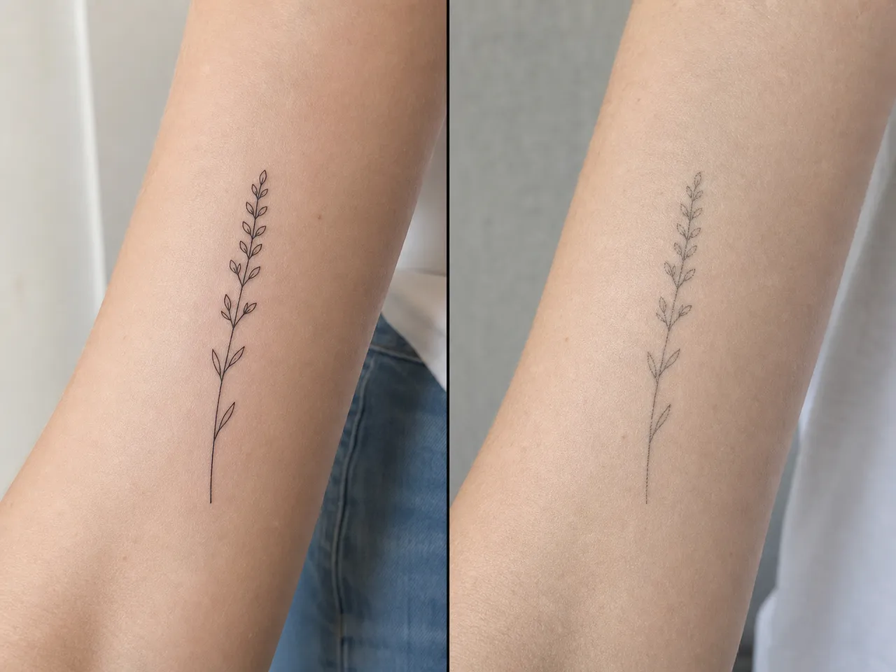
The mechanism is straightforward. Thin lines have less ink mass per unit length than thicker lines. Skin sheds and regenerates continuously, taking small amounts of ink with it every cycle. A bold blackwork tattoo loses some sharpness over a decade but stays readable. A fine line tattoo loses readability over the same period — lines fragment, gaps form, the design drifts from "delicate" to "indistinct."
Honest timeline for a well-executed fine line piece:
- Year 1: looks identical to fresh, ink fully settled
- Years 2–4: faint softening, especially in high-friction zones
- Years 5–7: visible fragmentation if placement was high-friction (inner wrist, fingers, top of foot)
- Years 8–10+: most fine line pieces need a touch-up to stay sharp
This isn't a reason to avoid fine line — it's a reason to be clear-eyed about it. The mitigations are real: pick low-friction placement (outer forearm, upper arm, calf, outer thigh — the placement guide goes deeper), expect a touch-up around year 5–7, and don't pick fine line if you want a tattoo that looks identical in 15 years. For that, you want bolder line weight in a different style — explore the other styles in our catalog before locking in.
Fine line is the right style if you want something quiet, monochrome, and skin-readable as art rather than statement — and you're at peace with the maintenance cycle. AI is a useful starting point for the design phase as long as you treat the output as direction the artist will reshape, not a literal blueprint. Run a few fine line prompts through InkedByAI's generator before your consult — six free credits is enough to land on a direction your artist can actually translate.
