
Most tattoo regret isn't about the design. It's about where it ended up.
A clean fine-line rose looks different on the wrist at 22 than it does at 42. A bold sleeve reads like a statement at the gym and like a problem at a banking interview. A ribcage script is gorgeous in a mirror and impossible to see in a photo.
Placement is half the design. Usually the half people skip.
The five trade-offs that decide everything
After enough conversations with working tattoo artists, every placement decision really comes down to five trade-offs. Walk through them once and the right placement usually narrows itself.
Pain. Bone proximity, nerve density, skin thickness. Ribs, sternum, hands and neck are brutal. Outer arms, thighs, calves are manageable.
Visibility. Hands, fingers, neck, face are always visible — and still job-coded in finance, law, healthcare, government. Arms and calves are visible by choice. Ribs, hips, chest, thigh are private by default.
How it ages. Sun exposure (forearms, calves) fades fine-line work. Stretchy areas (inner arms, ribs, stomach, thighs) blur fine detail over a decade. For a 50-year tattoo, pick low-sun + low-stretch (outer upper arm, outer thigh).
Geometry fit. Vertical designs (snakes, scripts) belong on forearm, ribcage, calf. Horizontal scenes belong on collarbone, lower back. Round pieces (mandalas, portraits) belong on shoulder, thigh, chest.
Future tattoos. A first tattoo on the wrist boxes you in. On the outer upper arm or outer thigh, you keep prime real estate open for sleeves or leg pieces later.
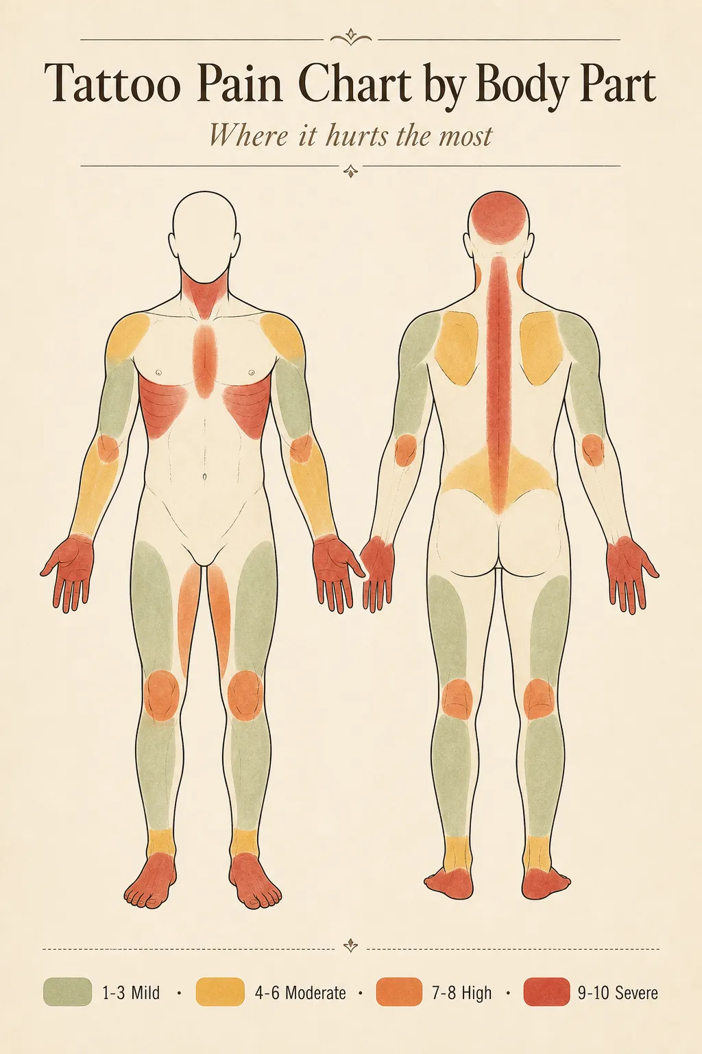
The placements actually worth knowing
Outer upper arm / shoulder cap
Pain 2–4. Visibility opt-in. Ages excellent. Best for round designs — animal portraits, mandalas, traditional flash, neo-traditional.
This is the spot most artists recommend for a first tattoo. Forgiving in every dimension.
Outer forearm
Pain 3–4. Always visible in short sleeves. Ages well if you sunscreen. Best for vertical or wrap-around — scripts, snakes, climbing florals, blackwork panels.
The most "show-and-tell" placement. If you want it seen daily, this is it.
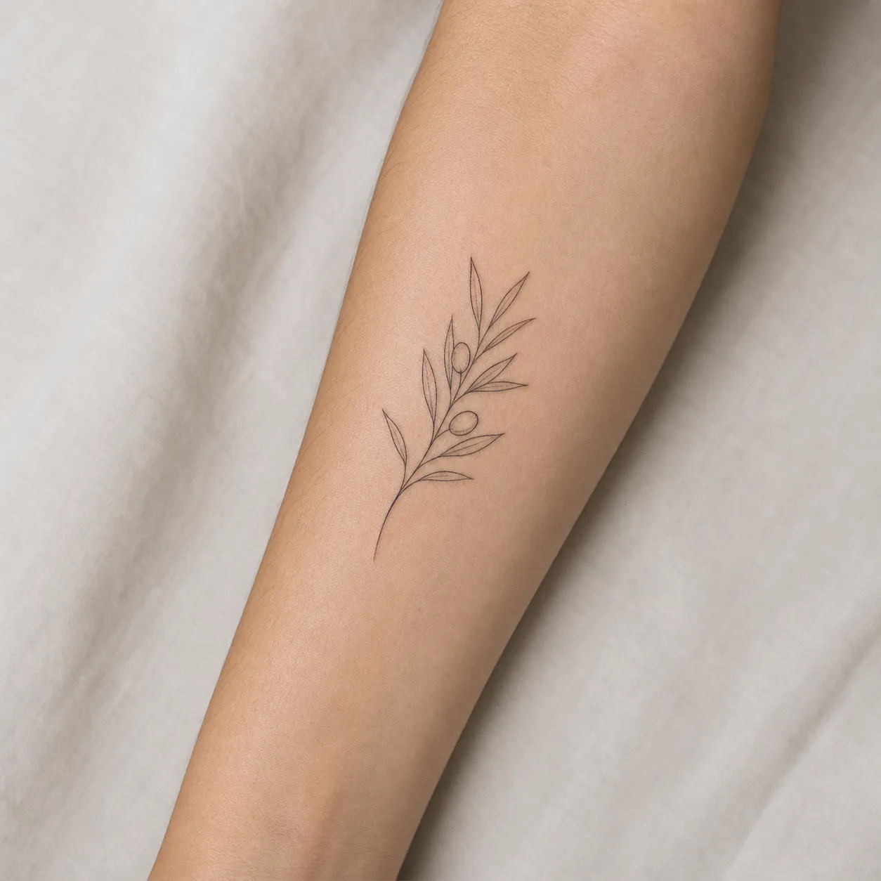
Inner forearm
Pain 4–6. Opt-in visibility. Ages well. Best for scripts, small portraits, fine-line botanicals.
The classic spot for meaningful tattoos — quotes, names, personal symbols — because it's positioned to be seen by you, not just other people.
Wrist
Pain 5–7. Always visible. Ages worst on the arm — the wrist bends thousands of times a day, fine work blurs.
Wrists look great fresh, regret happens at year five. Keep it bold and simple, or pick somewhere else.
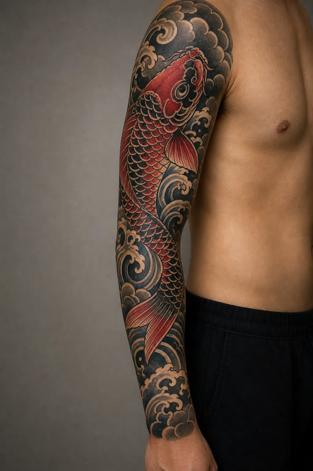
Sleeve
Pain varies — inner arm hurts, elbow ditch is brutal. Always or opt-in visible. Best for narrative work — Japanese irezumi, traditional flash compositions, blackwork ornamental.
A sleeve is not one tattoo, it's a curated composition. Plan the whole arm first, then start filling.
Chest / sternum
Pain 5–8 (sternum is brutal, pec is moderate). Opt-in visibility. Ages well.
Underrated canvas. Sternum work has exploded for ornamental and floral pieces — symmetrical and dramatic.
Ribcage
Pain 8–9. The most painful spot, no debate. Opt-in visibility. Best for vertical compositions following the rib line.
Gorgeous and brutal. Most artists split large rib pieces across multiple short sessions because long sessions here are torture.
Back
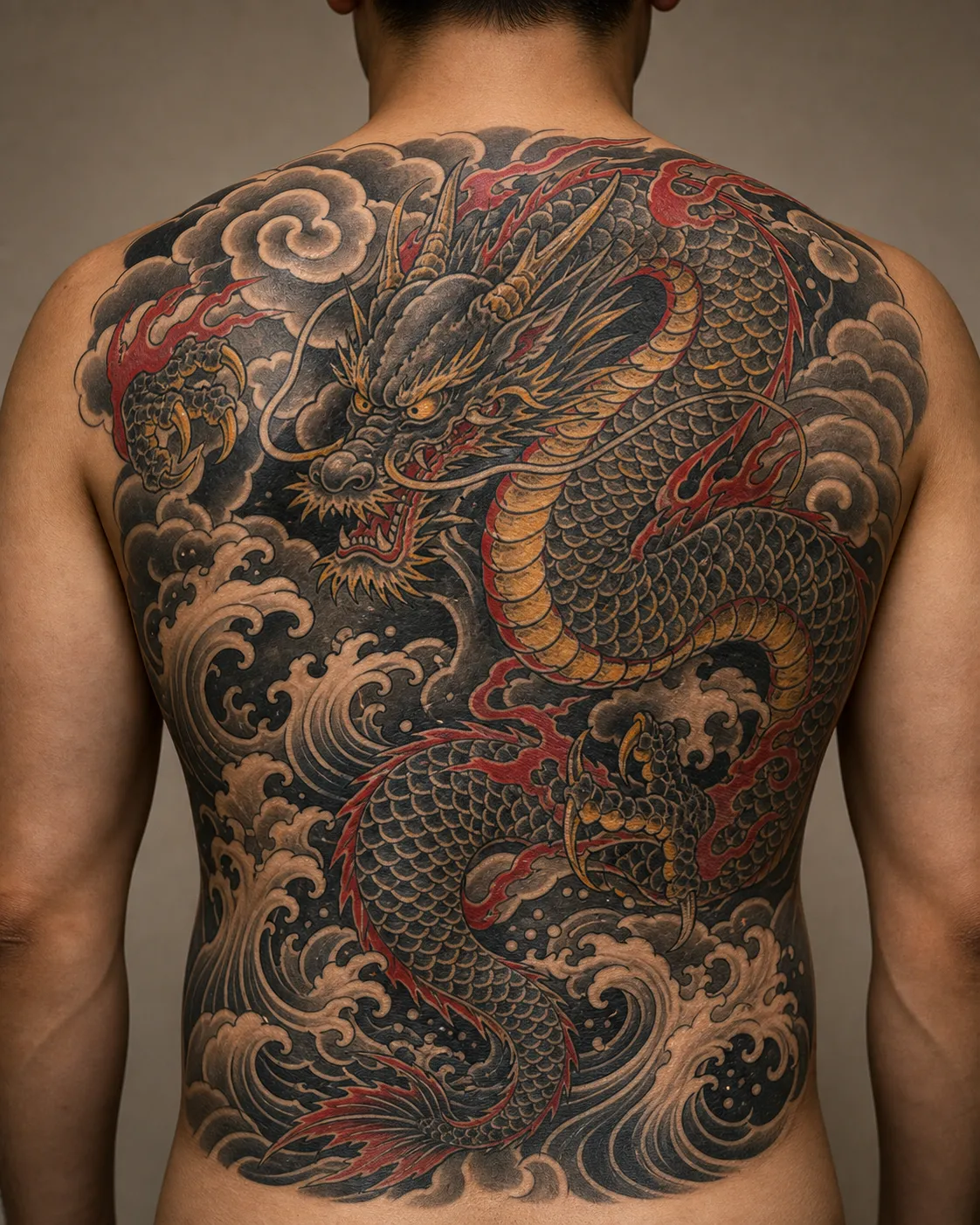
Pain 3–6 (spine is 8–9). Opt-in visibility. Ages excellently — low sun, low stretch, thick skin.
The place for an epic tattoo. The trade-off: you'll never see it directly. Some find that spiritually appropriate. Others wish they'd put the energy somewhere they could enjoy daily.
Outer thigh
Pain 3–4. Private by default. Ages excellent.
The most slept-on placement in tattooing. You get nearly a back's worth of canvas with arm-level pain and total privacy.
Calf
Pain 3–5. Seasonal visibility. Best for medium-large bold pieces — animal portraits, Japanese, traditional, blackwork.
Great for people who want visible-when-they-want-to-be tattoos.
Hands, neck, face
Pain 7–9. Always visible. Hands age the worst on the body — fade and blur faster than anywhere else. Neck is still job-coded. Face: talk to your artist, talk to a therapist, wait six months.
Most experienced artists refuse to do a hand tattoo as your first. It's not snobbery — it's that hands age badly and are professionally limiting.
How to test placement before you book
This is the cheat code most people miss. Before committing, do all three:
1. Print the design at actual size and tape it on. Live with it for 48 hours. Different lighting, outfits, mirrors.
2. Take photos from awkward angles. What looks great in a mirror looks different in a selfie, in a photo, from below.
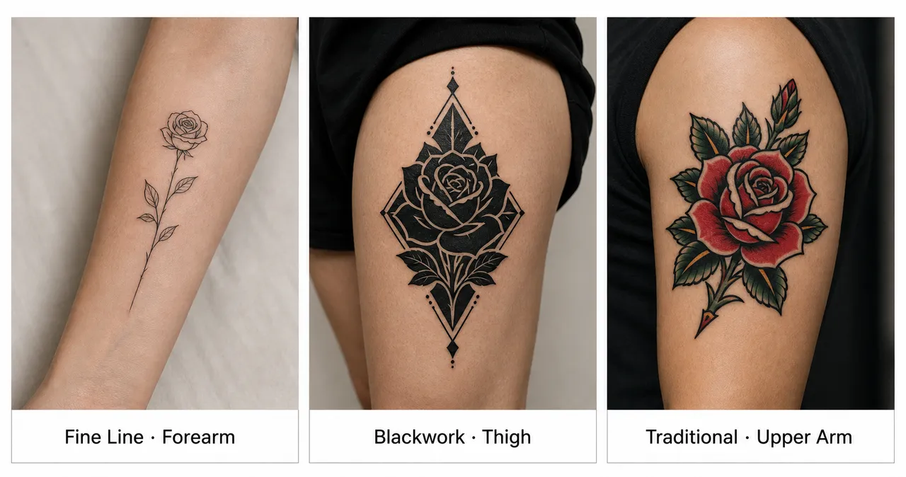
3. Generate the design at different placements as separate runs. Try your subject as fine-line on the inner forearm. Then run it again as blackwork on the outer thigh. Then traditional on the upper arm. Each generation is independent — your history keeps them all so you can switch between them and compare. Seeing the same idea in different placement/style combos saves a lot of "I thought it would look different."
The third one is what we built InkedByAI for — here's the full walkthrough on how to design a tattoo with AI. The first two are still on you.
A decision shortcut
If you walked into the shop with no idea where to put it:
- First tattoo? Outer upper arm or outer thigh.
- Visible daily? Outer forearm.
- Visible only to you? Inner forearm.
- Private statement piece? Chest, outer thigh, upper back.
- Epic narrative? Back, full sleeve, leg sleeve.
- Visible and small? Wrist or ankle, but keep it bold and simple.
When in doubt, the experienced answer is almost always outer upper arm. There's a reason artists keep recommending it.
If you have a design idea but you're stuck on placement, the most useful next step is to see your idea on different parts of the body. Sketch placement variations with InkedByAI → — free credits on signup, no card required.
