Minimalist is the style people pick when they want a tattoo without the commitment of a tattoo. The instinct is honest. The trade-offs that follow — size, subject, placement, aging — aren't what most guides discuss.
Most "minimalist" tattoos are actually fine line
The two terms get used interchangeably, but they describe different things. Minimalist is about element count: how few visual components a design uses, how much white space surrounds them, how restrained the composition feels. Fine line is about needle technique: single-needle (or 3RL at most) application that produces hairline weight on skin.
You can have minimalist work executed in bold line weight — three thick concentric circles, a chunky single arrow. You can have fine line work that's maximalist — an intricate floral half-sleeve done entirely in single-needle linework. Both exist, and both get called "minimalist" in casual conversation.
There's no universal industry definition that draws a hard line between the two terms either — different studios use them differently, and the practical distinction below is based on what produces consistent results over years, not a textbook rule.
The confusion matters because when you walk into a studio and ask for "minimalist," what most artists will show you is their fine line portfolio. Fine line is the technique most modern minimalist commissions use, but the conflation hides a trade-off you should make consciously: thin line weight ages faster than thicker work. Choosing "minimalist plus fine line" is a separate decision from choosing "minimalist plus bold line weight," and the longevity outcomes differ by years. If you want minimalism — restraint in elements — you don't have to accept thinness as a package deal. Ask your artist about a 5RL or 7RL group for bolder linework that still reads as minimalist composition.
Two-inch designs lose readability faster than four-inch ones
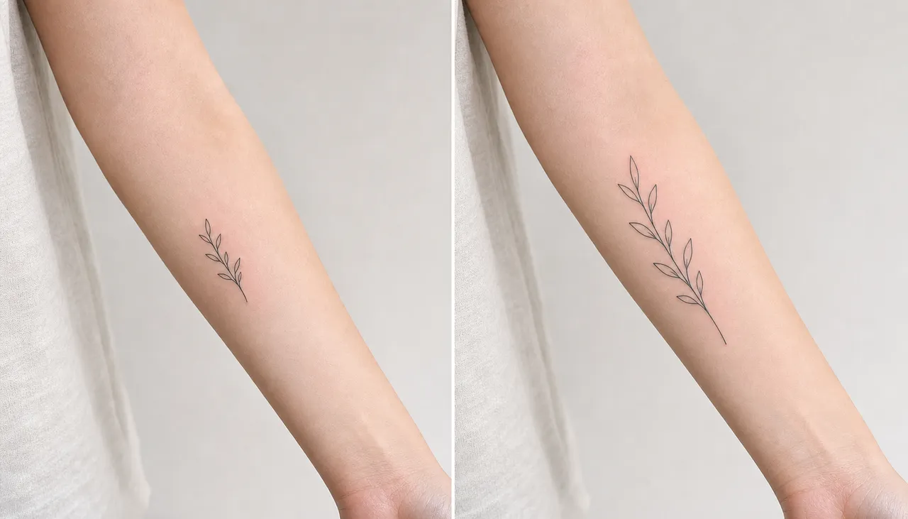
There's a default assumption that minimalist equals small. It doesn't. Minimalism is about composition restraint, not physical scale. A six-inch piece with three elements and significant negative space is more minimalist than a two-inch piece with five overlapping symbols.
The size trap is intuitive but real. Most first-timers asking for minimalist pick a one-and-a-half to two-inch scale because they're new to ink and committing small feels safe. Then the design loses identity by year three. The mechanism: at very thin line weight, small designs have very little ink mass per square inch of skin. Skin sheds and regenerates continuously, taking tiny ink particles with it each cycle. Larger designs absorb that loss as gentle softening; small designs absorb it as legibility erosion.
The rule that's actually useful: if your design has one to three elements, you can go small — two-and-a-half to three inches works. If your design has four or more elements, scale up to four to six inches to give each element room to age. Your artist will usually nudge you toward the larger end; that nudge is correct, not pushy.
The cleanest framework for sizing: ask yourself which version of the design you want still readable to a friend at coffee-shop distance in ten years. That's the version you should book — usually a third to half bigger than your first instinct.
Geometry, single lines, short text — and the things that don't translate
What survives minimalist treatment:
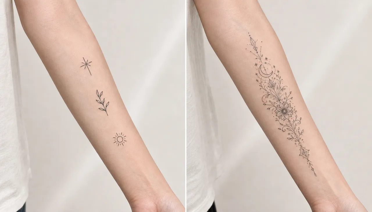
- Geometric primitives: circles, triangles, semi-circles, simple polygons. Sacred geometry with breathing room (not maximal pattern fills). Mandalas with two or three concentric layers, not seven.
- Single-line subjects: anything that can be drawn as one continuous unbroken line. Florals, abstract animals, faces in continuous-line style.
- Short text: one word, initials, dates of four to six characters. Anything past five or six letters at minimalist weight blurs to mush by year three.
- Symbolic markers: a single heart, moon, star, anchor. Functions like a logo — one element, full identity.
What doesn't translate, even though AI generators will render it beautifully:
- Realistic faces or animal portraits (depth and shading conflict with minimalist's defining absence of shading)
- Complex landscapes or scenes (multiple fine elements compete and blur together)
- Anything that relies on cross-hatching, stippling, or textured depth
- Quotes longer than five or six words (rapid legibility loss)
- Highly detailed objects — a realistic key, a pocket watch — these need thicker weight to read at any scale
If your reference image relies on detail or depth, you've probably picked the wrong style for the concept. Either simplify the concept or pick a denser style. Our AI tattoo design walkthrough covers prompting approaches when you're testing whether a concept can survive at minimalist scale, and the fine line guide goes deeper on the single-needle technique most "minimalist" commissions actually use in practice.
Sun, friction, and year five
Placement matters more for minimalist than for any other style, because minimalist has so little redundancy. A bold blackwork piece can lose a substantial amount of ink density and still read perfectly. A minimalist piece losing the same proportion can become unrecognizable.
Three placement variables drive minimalist longevity:
Sun exposure. UV radiation breaks down the dermis layer holding tattoo ink, and minimalist pieces — with less ink mass per square centimeter than bolder work — degrade visibly faster under the same sun. A wrist piece worn unprotected through summer can lose noticeable sharpness in two to three years. SPF 50+ applied whenever the piece is exposed extends that to seven years or more.
Friction zones. Inner wrist, fingers, top of foot, sides of palms — anywhere clothing or other skin rubs against the tattoo daily. These zones erode minimalist work in two to four years regardless of artist skill. The mechanism is mechanical: tiny constant abrasion lifts ink-holding skin cells. Bold work absorbs this loss; minimalist work doesn't have the cushion to.
Bone proximity. Pieces sitting close to bone (sternum, spine, ankle, ribs) spread faster as ink doesn't have soft tissue to settle into. Muscle-dense, low-friction zones — outer forearm, upper arm, calf, outer thigh — hold minimalist work cleanest. If you want a minimalist piece that looks the same in ten years, those four zones are your best options.
These timelines are based on patterns studios consistently report, not on a controlled study — there isn't one, and there can't be ethically. Your specific outcome depends on skin type, sun habits, and luck. The ranges hold for most people but the spread is real.
The year-five fork is real, though. A minimalist piece placed on outer forearm, applied at reasonable weight, kept out of direct sun — still recognizable, slightly softer, still itself. A minimalist piece on inner wrist, hairline weight, no SPF — by year five it's often a smudge that used to be something specific. The piece either earns its name or it doesn't.
The placement guide goes deeper on each body zone's aging characteristics. For a minimalist piece specifically, the short version: pick outer forearm, upper arm, calf, or outer thigh, plan on touch-up around year five if it's in a sun-exposed spot.
Minimalist asks you to keep something for decades without bold lines or rich color to protect it. It works when the design has restraint and the placement gives skin a chance. If you want to test what a minimalist direction looks like in your zone before booking, run a few prompts through InkedByAI's generator — six free credits is enough to explore four or five takes on the same concept.
