Short answer: a neo traditional tattoo keeps the heavy black outline of an American traditional tattoo and opens up everything inside it. Full color range instead of five flat colors. Layered shading instead of flat fill. Subjects pulled from illustration and Art Nouveau — animal portraits, botanicals, moon phases — rather than the old sailor catalogue of anchors and swallows. The trade-off is that the extra interior detail fades before the outline does, so the size you pick decides how much of it you keep.
Put an old-school eagle tattoo next to a neo traditional moth and the family resemblance shows up before the differences do. Both have outlines you could read across a room. Both sit flat and graphic on skin instead of trying to look like a photograph.
Then you notice the moth carries twenty colors where the eagle has five, plus a halo of thin decorative linework the eagle would never bother with.
That gap is the entire style. A neo traditional tattoo takes the skeleton of an American traditional tattoo and rebuilds everything hanging off it.
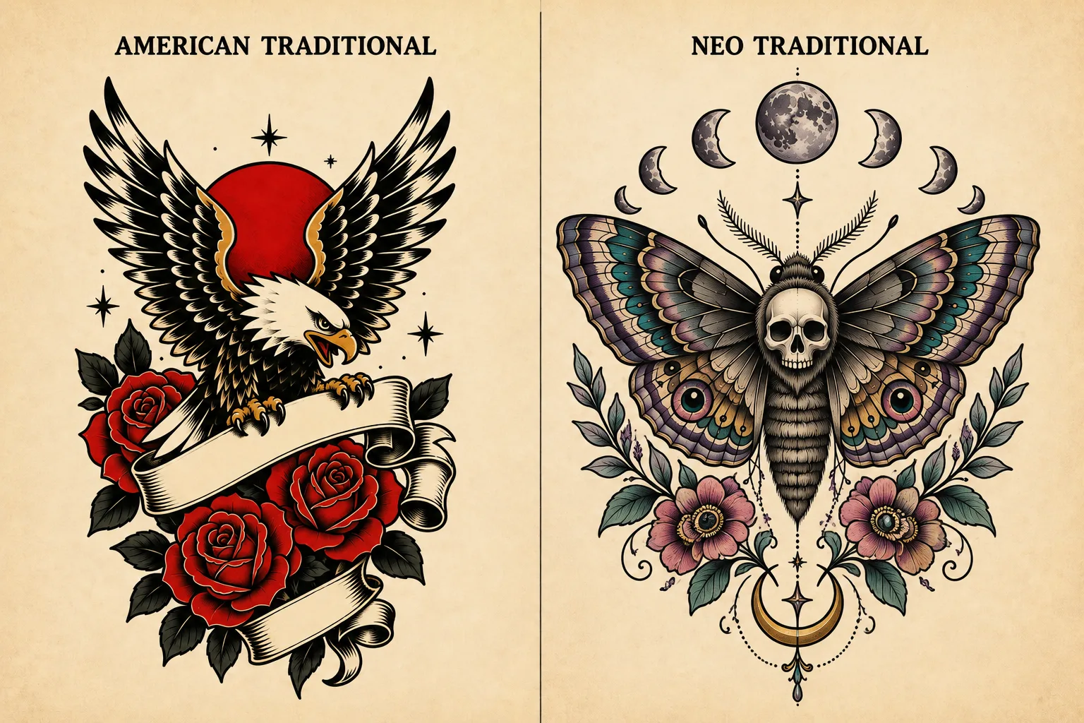
Both styles, standing next to each other
Most explanations of neo traditional tattoos assume you already know what old school is. Worth not assuming that, because the comparison is the definition.
American traditional is the sailor vocabulary that hardened into a school around the early 1900s — anchors, swallows, daggers, roses, panthers, hearts wrapped in banners. The palette stays tight: black, red, green, yellow, sometimes a muddy blue. Every shape gets reduced to its most readable version. Nothing rendered, nothing shaded into subtlety. That grammar exists for a practical reason. Early pigments were unreliable, and a tattoo had to survive decades of sun on a body that worked outdoors. Bold shapes and heavy black were what held.
A neo traditional tattoo starts from that grammar and opens it up. The style began surfacing in the 1970s and 80s, then became its own recognizable school through the 2000s. Same bold outline. Same flat, graphic sensibility. But the color range goes wherever the artist wants — peach, teal, lavender, deep plum — and the interior stops being flat fill. Fur gets layers. Petals get depth. Wings get pattern.
Subject matter moved too. Old school pulls from a closed catalogue of symbols. Neo traditional tattoos run on animal portraits, women's heads in profile, botanical arrangements, moon phases, ornamental frames — much of it borrowed from Art Nouveau and modern illustration rather than from naval tradition.
So when people ask about neo traditional tattoo vs traditional, they are usually expecting a rivalry that is not there. One school grew out of the other, kept the load-bearing part, and dropped the constraints that came from 1920s ink chemistry. If you like the boldness of old school tattoos but find the subject catalogue limiting, neo traditional is the answer somebody already built for you.
What actually changed, item by item
The comparison gets easier when you stop treating it as a vibe and look at the four things that genuinely differ between a traditional tattoo and a neo traditional one.
Color. Traditional works from a small palette applied flat. Neo traditional has no palette restriction and shades gradients inside shapes. This is the difference you notice first and the one carrying the most risk, which we will get to.
Detail density. A traditional rose is maybe eight shapes. A neo traditional rose might have forty — layered petals, interior shading, a few stray highlights. That density is the appeal. It also ages the worst.
Subject. Old school pulls from a fixed catalogue. Neo traditional treats the bold outline as a technique you can apply to nearly anything, which is why so many fox heads, moth wings, and hands holding candles show up in the style.
Line hierarchy. The one people miss. A traditional tattoo uses roughly one heavy weight for everything. Neo traditional tattoos use a heavy outline, plus lighter internal lines, plus sometimes very fine decorative work at the edges. Three tiers instead of one.
That last difference is where the promise of the style lives, and where it partly breaks.
The color question: delivered, with a bill attached
Neo traditional tattoos deliver on color. No argument to have here — the range is genuinely wide, the gradients hold, and a well-executed piece looks nothing like the flat five-color palette it descends from. If color is why you are drawn to the style, you will get what you came for.
The bill arrives on skin rather than on paper. Light colors sit shallower in practice and lift faster, particularly the pastels and yellows this style reaches for. A peach gradient that reads beautifully at three months can go patchy by year six in a way the black outline around it never will. Artists who work in neo traditional a lot tend to anchor the composition in heavy black and treat color as something that will want attention eventually — a touch-up every several years rather than a one-time purchase.
This is a different problem from watercolor. Watercolor tattoos often carry no outline at all, which is why they blur into unreadable shapes rather than fading gracefully — the watercolor guide covers that fade timeline properly. A neo traditional tattoo losing color intensity still has its structure. It reads as a faded version of itself, not as a smudge on your arm.
The durability question: partly, and it hangs on one variable
Here is the claim neo traditional carries around: old-school longevity with modern range. It is why people pick it over fine line when they want detail but have heard the horror stories.
The claim holds in proportion to how heavy the linework is and how large the tattoo runs.
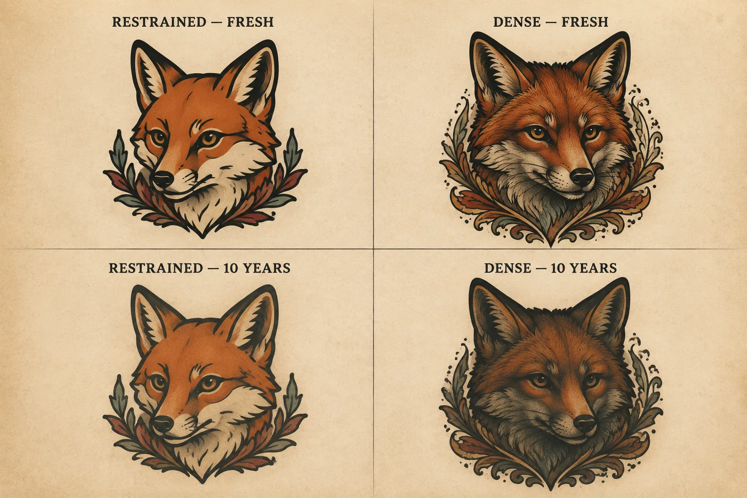
A neo traditional fox head at palm size, bold outline, restrained interior detail, will age close to how a traditional tattoo ages. The outline does the same job it always did. Ten years on, it still reads as a fox.
That same fox at two inches, every whisker and fur layer rendered, is a different object. Those interior lines sit close enough that natural ink spread eventually merges them. What survives is the outline and a dark middle — the detail you paid for is the first thing to go. Same physics that makes fine line tattoos risky, and the fine line guide walks through why thin lines behave that way.
So the durability promise is real, but it is a promise about the outline, not about the whole image. Size decides how much of the interior comes along for the ride. A useful way to think about it: pick the size first, then let the size dictate how much detail the design can carry. Most regret in this style runs the other way around — falling for a dense reference image, then shrinking it to fit a spot it was never drawn for. Placement compounds this, since high-friction and high-sun zones accelerate everything.
One part I cannot fully back up: the style is young enough that nobody has clean forty-year data on the dense end of it. Traditional tattoos have a century of evidence walking around on people. Neo traditional as a distinct school has a couple of decades at scale, and the heavily rendered version is newer than that. Artists have strong opinions about how the dense pieces will hold, and those opinions come from watching real skin — but they are still projections, not results.
Subjects that suit a neo traditional tattoo
Some subjects were made for this treatment. Others fight it the whole way.
Animal portraits are the safest bet. The bold outline gives the silhouette authority while the interior rendering carries texture — fur, feathers, scales. A neo traditional owl or fox or stag has somewhere to put all that detail, and the shapes stay legible even when you scale them down a little.
Women's heads in profile, usually with floral or ornamental framing, are close to a signature of the style. If you have seen a neo traditional tattoo on someone and could not name what made it that style, there is a decent chance it was one of these.
Botanical work suits it for the same reason animals do: peonies, roses, chrysanthemums have layered structure that justifies the density. A traditional rose gives you the idea of a rose. A neo traditional rose gives you petals that overlap and cast shadows on each other.
Ornamental and celestial designs — moon phases, geometric frames, decorative borders, jewelry-like linework — work because the finest tier of the line hierarchy finally has a job. This is also where the style borrows most visibly from Art Nouveau.
What struggles: anything demanding photographic accuracy, since a bold outline argues with realism at every step. Very small tattoos, for the density reasons above. And lettering-driven designs, which get nothing from what this style is good at — a quote in a neo traditional tattoo is usually just a quote with a decorative frame around it.
On size, the rough working numbers artists throw around: a neo traditional tattoo with moderate detail wants four inches or more on its longest edge. Portrait subjects with fur or feather rendering want five or six. Below three inches you are essentially buying the outline and a suggestion of what was inside it, which can still look good — plenty of small old-school tattoos prove that — but you should choose a design drawn for that scale rather than shrinking a dense one. Ask your artist directly what they would cut to make your reference work at the size you want. The answer tells you a lot about whether the idea survives the trip.
Seeing it on your own idea before you commit
The distance between "I think I want a neo traditional tattoo" and knowing whether your specific idea suits the style is mostly a visualization problem. Reference photos show you other people's finished tattoos. They do not show you yours.
Both neo traditional and traditional sit among the 22 tattoo styles InkedByAI generates, which makes the comparison something you can run rather than imagine. Describe your subject once, generate it as a traditional tattoo, then generate the same subject as neo traditional, and put them next to each other. Every result stays in your gallery, so you are comparing actual images instead of holding the first one in memory while looking at the second. The free credits on signup cover several rounds of this, which is enough to find out whether your idea wants the old-school treatment or the modern one.
Worth being clear about what that gets you. A generated image is a reference for a conversation with an artist. It is not a stencil, and it is not a prediction of how the tattoo ages. The density question from earlier is exactly the kind of thing a tattooer adjusts once they see your skin and know the size you want — they will thin out interior detail you were attached to, and they will usually be right to. What the generator buys you is walking into that conversation with a picture instead of a style name you read on the internet.
If your idea comes back looking better as a traditional tattoo, that is a real answer too. The eagle has held up for a hundred years for a reason.
